200dtd-Saxton-suburb-teams
Sprint 1 - A Working UI Prototype
Sprint Goals
Develop a prototype that simulates the key functionality of the system, then test and refine it so that it can serve as the model for the next phase of development in Sprint 2.
Figma is used to develop the prototype.
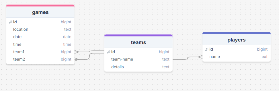
Initial Database Design
This is the initial design for the database linking players to teams and games to teams games have the data for when and where the game is and what teams will be playing there the players table holds the players names and the teams table stores the team name and details about the team
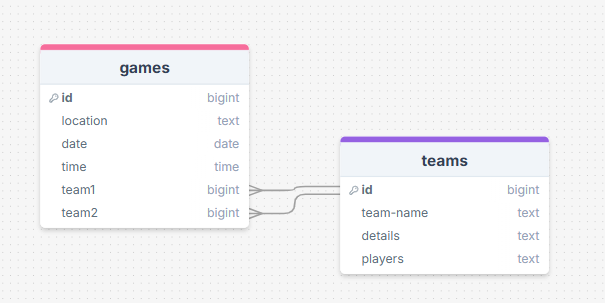
Database Design
I have decided that 2 database would work better
UI ‘Flow’
The first stage of prototyping was to explore how the UI might ‘flow’ between states, based on the required functionality.
This Figma demo shows the initial design for the UI ‘flow’:
Testing
while testing my end user pointed out if there are lots of teams which there will be that it may get harder for them to find the team they are looking for and I figured the same would happen with the admin panel when wanting t edit the teams information also they didn’t like the though of someone else knowing where they kid is going be though out the day the end user found on the page where we add a team that im using space the doesn’t need to be used and i also came to a realization that my website would be best on phone and would required a good font size to read off of a phone
Changes / Improvements
I redesign the first page so there was a sech bar with a drop down menu and same for the admin panel and I found a way to free up some more space on the edit or add team page and I removed the ability for people to see which team the kids are in un lest their an admin by having it only show on a page that only they can get to.
Initial UI Prototype
The next stage of prototyping was to develop the layout for each screen of the UI.
This Figma demo shows the initial layout design for the UI:
Testing
As testing I kept changing things make the ui flow better for what I wanted I mostly just change the size and placement of things till it worked
Changes / Improvements
the ui was kind of ugly and was just made out of a bunch a low quality boxes and text so I made it look better and made it so it works on phone as well
Refined UI Prototype
Having established the layout of the UI screens, the prototype was refined visually, in terms of color, fonts, etc.
This Figma demo shows the UI with refinements applied:
Testing
I kept flipping throughout the pages making changes to color and front un till i was happy with it
Changes / Improvements
because the webpage was mostly a darker color I found that some of my text had to be white so the user could read it
Sprint Review
we have a good blue print for the website which will help us make the website.